28.11.10

LINOTYPE: THE FILM: TRAILER


FILM - "Linotype: The Film" is a documentary about Ottmar Mergenthaler's amazing Linotype typecasting machine and the people who own and love these machines today.

This film is about a machine from the past, but that does not mean this is a sentimental fact-film lamenting the loss of a technology. We are compelled to dig deeper, and find what the Linotype has to say about the present and future.

To make this film, we have extensively researched and talked with experts to learn as much as possible about the history of the Linotype and how the machine works. We’ve been able to talk to numerous people in the Linotype community, from small town printers to typesetters for national publications.

joes[a]fiend

24.11.10

THE UNDERGROUND GOES OVERGROUND


SPOTTED - At the Whitechapel underground/overground station the underground goes overground.

joes[a]fiend

20.11.10

TRUTH + TRANSPARENCY = TRUST


SPOTTED - On a recent trip to the north of England (to teach a group of third year university students) I spotted this poster showing the exact amount of money that had been raised at the train station for The Poppy Appeal.

What struck me was, the person who made the somewhat shoddy poster had a fantastic insight into people:

: The poster extends the relationship with The Poppy Appeal past the initial interaction/donation

: It makes donors feel that their contribution is part of a larger community/group effort

: It offers feedback, we all like to know how we're doing

: It enhances trust, how many times have you dropped your small change into a collection box in exchange for a 'social badge', then never hear anything from the charity again?

: The hand-drawn element adds a human element to the charity. It shows that there is indeed a real person counting the donations, not some automated banking machine

: Most importantly, it thanks donors for their contribution

I personally feel brands/charities need to learn that by being truthful and transparent, they will earn the trust of the people. This poster embodies key elements that brands/charities must embrace to earn the trust of the public.

If you've seen anything similar to this, drop us a message.

joes[a]fiend

17.11.10

ACCIDENTAL? BRILLIANCE? ACCIDENTAL BRILLIANCE?

SPOTTED - Last night I attended the launch of the Hermès pop-up store in the Rochelle School Of Art. The aim of the store is to show people how versatile the iconic Hermès scarves can be. In addition to the pop-up store Hermès has created a Fanzine in collaboration with photographer Matt Irwin. Irwin took four models around the world to capture the ways you can wear the Hermès scarf.

As part of the festivities the incredible LA based band Warpaint played a few songs from their debut LP The Fool [Rough Trade Records].


Before Warpaint came on stage I noticed what must have been a Hermès employee tying a scarf to the bass drum [that's the big one in the middle]. I thought to myself, that's quite subtle, a nice little branded touch. When Warpaint came on to play, this all changed, it soon became a stroke of absolute genius or complete luck. As the drummer [Theresa Wayman] began to beat the bass drum it caused to Hermès scarf to flutter elegantly to the beat, it was mesmerising.


Now, cast your mind back to December 2009, when Japanese designer Tokujin Yoshioka had an installation in Maison Hermes in Japan. The installation was a window with an image of a woman projected on to a monitor. It would appear from the outside that the projected face was gently blowing a Hermès causing it to flutter in the wind.

Was this tie in a piece of marketing genius, or sheer good luck?

It would make sense for Hermès to create a campaign based on the beauty of the flowing movement of their iconic scarves. Imagine a campaign where you see a close-up of the fluttering scarf which then panned out to an iconic moment. The image that springs to mind when I think of the Hermès scarves is a chic woman driving a 1985 convertible Mercedes SL with the top down, on a hot summer's day in the south of France. Imagine the shot; close up of the scarf flowing in the wind [possibly in slow motion], then a soft zoom out to the striking, powerful woman driving the car. Formidable!

joes[a]fiend

6.11.10

FARM:LONDON

RETAIL - 'How much food can we grow in a shop?' Was the question posed by FARM:London, a concept devised by Something & Son, an eco-social design practice. They aim to answer the question at 20 Dalston Lane, a derelict shop they have converted into London's first urban farming hub.

At FARM:shop you'll find exhibitions that change with the seasons and as nature takes it's course. For the opening you can expect to see the following:

- 'Aquaponic' micro fish farming
- High tech Indoor allotment
- Rooftop chicken coop
- Polytunnel

FARM:shop Dalston [illustrated above] has three main aims:

1 To excite and inspire Londoners to grow their own food, fabric and medicine
2 To create direct links between farms outside London with communities in London
3 To grow food commercially via a network of FARM:'s across London

If you've made it down to FARM:shop let us know what you thought of the concept/space.

joes[a]fiend

13.10.10

KEROUAC'S DOG : NEW TRICKS


We were so intrigued by the title of Kerouac's Dog, a new cultural magazine [covering new writing, design, illustration, photography, architecture, fashion, and creativity in general], that we had to grab 5 minutes with its creator, Oli...

First off, please tell us a little about your background and how the Kerouac’s Dog Magazine came to be.

The whole project began as an itch in my head that simply refused to go away. I was travelling Australia in 2008, and one hot summer evening in my apartment in Surry Hills, Sydney, I sat down and scribbled down what I wanted.

I wanted a magazine that was truly independent, with no advertising, no classifieds, and no editorial-led advertising. I wanted a magazine that oozed pure creativity, with a free-thinking, uncensored, underground-press feel. I wanted to give aspiring creatives of all disciplines, from all over, the opportunity to exhibit new writing/new design/ new illustration/ new photography/ new whatever, in something beautiful and tangible. And at the same time, pay homage to the philosophy of the
Beat Generation. Kerouac’s Dog Magazine was born. I suppose the idea was conceived long ago, but born when I actually put pen to paper and started putting things in place to make Kerouac’s Dog a reality.

Why Kerouac's Dog? Why now?

Because I genuinely believed it was needed. I think keeping print alive in a truly independent publication in a digital world is really important. In a digital age, getting stuff in print; in something real and tangible is incredibly exciting. I think having something that you can hold; that you can thumb through - rather than click-through, scroll through, or touchpad flick-through - is still an exceptionally beautiful thing. It still means something. It’s evocative, resonant, and it stays with you.

Who out of the people that you're working with should we be keeping an eye on?

I’m not going to pick anyone out, mainly because the work that has been submitted for the inaugural issue, and Issue 2 next year is of such a great standard. But yes, there are lots of people you need to be keeping a serious eye on.

What format is the magazine? Which magazines do you see it sitting alongside?

Issue 1 is A4 – and we’ve got other format ideas for future issues too. [Except digital – Kerouac’s Dog will exist solely in printed format.]
Well, I hope it stands out on its own. I don’t think I’d be doing it any justice if I tried to group it with other magazines.

As you aren't having print ads are you looking to collaborate with brands at all?

We’ve started as an independent, and we want to continue to be independent. Many ‘independent’ magazines that exist today, started off the same as we did, and have, for one reason or another, given in to advertising, and brand and organisation collaboration – mainly for financial reasons. True independence is a tough ideal to live by, especially when you’re totally self-funded, but I think it will be worth it.

What are your favourite magazines?

Wow. Where do I start. There are so many. I love
EYE magazine. I love Wallpaper* Magazine. I also read a lot of ‘Mad’ while in Australia too – that was really great.

Where do you see Kerouac's Dog in a year?

Still having fun; still getting new creative work out there; still believing in ourselves, in why we’re doing what we’re doing, and in the people who submit such awesome work; still holding on to that creative fire that got us into this.

joes[a]fiend

2.10.10

I LIKE NY

GRAPHIC DESIGN - Utpal Pande has given the iconic I Heart NY logo designed by Milton Glaser a reworking for the Facebook generation.

joes[a]fiend

9.9.10

1-BIT SYMPHONY - TRISTAN PERICH


MUSIC
- 'With 1-Bit Symphony I wanted to revisit that an album of music could be more than just a recording, more than just an audio CD and when you listen to an album you could actually be experiencing first hand the production of the music itself' Tristan Perich.

The aspect of 1-Bit Symphony which truly captures our imagination is how the artwork transcends the divide between between aesthetics and the music. Is it the modern equivalent of having a song sheet for an album cover?

joes[a]fiend

30.8.10

THE NAMESAKE [2006]

CINEMA - This new addition to joes[a]fiend is pretty simple. Each film I watch from now on, I will compile a series of screen grabs to catalogue the visual delights within each film. These could vary from extreme emotions, scenery, fashion or anything that I find visually arresting.

The first film of the new section is The Namesake [2006] directed by Mira Nair. To see all 30 or so 'movie moments' click here.

joes[a]fiend

3.8.10

WHO'S BEEN GIVING APPLE THE FINGER?

ADVERTISING - The Apple adverts created by TBWA have always shunned the 'harder, faster, stronger' approach that many consumer electronic goods opt for in their advertising. Instead they go for a benefit based approach to their campaigns. Whether it be how an app on the iPhone can help you spot tree leaves or aid your cooking, the user benefits are always clear to see beyond a bigger screen etc.
The thing that has been bugging me of late is, whose finger is that in the Apple adverts? Are Apple adverts the Holy Grail for finger models? Is it even a real finger? Do Apple localise the finger for specific regions? The more I look at it the stranger it looks.

Do you know who the finger belongs to?

joes[a]fiend

30.7.10

LUXURY MAKES ITS WAY INTO THE DIGITAL WORLD

DIGITAL - In a world where the oxygen we breathe is digital and Facebook has reached 500 million active users, it is clear that the way we communicate, consume and create has fundamentally transformed. Brands are beginning to realise that the ‘old’ way of retailing might not be the best way. When it comes to the luxury industry digital is often completely ignored.

Marc Jacobs is a prime example of an innovative, edgy luxury brand yet is only entering the world of e-commerce this September. Let us not forget that Net-A-Porter was founded in 2000; so it has taken the Marc Jacobs brand 10 years to realise that online is not just a place for bargain fashion. I personally thought 2010 would be the year for flying cars, not luxury brands realising that the Internet might be a key retail space.


This brings us neatly to the events of last week, I was kindly invited to the Veuve Clicquot Polo Gold Cup: nice to be invited but men on horses hitting a ball isn’t really me. However, when the guys at Veuve mentioned their new iPhone app [iTunes link], my eyes began to roll into the back of my head, with undertones of yellow. Then they mentioned GPS and a champagne concierge and my ears were pricked. The Veuve Clicquot iPhone app allows users to order champagne within the polo ground, which is then delivered to your location via the iPhone's GPS tracker.

In my day job as a trend forecaster for The Future Laboratory we talk about living ‘inline’; this is the notion that living online or offline no longer exists due to ubiquitous connectivity and we now live ‘inline’. To me the Veuve Clicquot app was the embodiment of ‘inline living’. The brand is offering the ‘luxury moment’ facilitated by a digital device.

One of my favourite restaurants in London, Bob Bob Ricard, has a button at each table stating very simply ‘PRESS FOR CHAMPAGNE’. It is quite incredible how often your finger ends up pushing the magical button. Both of these levels of service work because they make your life simpler; they allow you to consume the product in a seamless manner and, most importantly, they make you feel special.


joes[a]fiend

22.6.10

SCAN TO SEE WHAT INSPIRES ME...


BRANDING - The 600+1 video was commissioned by Nike Global Design Team. The aim was to create a 2min video about what inspires Shanghai based creative Yehenala.

There are nine stories in the video, and a QR code is always centered in the frame. 'inspiration' is hiding behind the code, audience need to scan the code and receive a URL link to a web page. The web page contains photos of 'inspiration' in each of the nine stories in the video.

joes[a]fiend

13.6.10

GEOTAGGED IMAGES BECOME ART

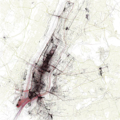
London

New York

DATA VISUALISATION
- I'm currently slightly obsessed with infographics and data visualisations. If you haven't got InformationIsBeautiful.net bookmarked or on your RSS reader, you should!

The maps above of New York and London created by Eric Fischer show where photographs have been taken. Location data comes from the public Flickr and Picasa search APIs.

As you can see the more photographs that are taken in a specific location the higher the concentration of lines. The images start to depict an interesting narrative as to where is popular and were isn't. It would be great to see this map in real-time, you would begin to see physical parts of your city 'trending'.

To see all 100 maps click here.

joes[a]fiend

6.6.10

HUMAN BILLBOARDS MAGAZINE BY STUDIO ROOMSERVICE


PUBLISHING - Some of you may know that eBay is rife with people selling their bodies as an advertising medium. For over two years, graphic designer Jacco Kranenburg purchased as many of these human billboards as possible to advertise his design studio Roomservice.

This is what Jacco told us about the reasoning behind the project:

"Out of sheer curiosity, I started to bid personally on several human billboard auctions. One thing that struck me was the utter confidence with which the different providers presented themselves.Without an exception, they were all convinced that they could provide unique and valuable advertising opportunities. For over two years I purchased as many of these human billboards as possible, advertising my design studio and web address. Instead of actual effective advertising, it did provide me with some delightful views into personal lives. Some of these most fascinating transactions are presented in this magazine."

How much would you sell advertising space on your body for?

joes[a]fiend

25.5.10

A CLEAR BRAND MESSAGE

ADVERTISING - In a time of 'brand blandness', it is even more important for brands to step up. American Apparel has a pedigree of doing this, although its efforts are sometimes over shadowed by it founder's [Dov Charney] somewhat questionable behaviour.

For this advertising campaign American Apparel gets eleven out of ten. It takes courage for brands to take the lead and it can leave them somewhat vulnerable to the press if their credentials don't stand up to scrutiny. If the brand can withstand the pressure, why not step up, be counted and make an impression?

joes[a]fiend

23.5.10

SUPERMARKET FASHION

SPOTTED - The term ‘fast fashion’ has become common in recent times, as of last week it gained a whole new meaning for me. I found myself with half an hour to spare before a meeting near Topshop [Oxford Street, London], so thought why not pop in have a little look around to kill some time?

Whilst loitering in the store, observing what people were picking up and generally being nosy I heard a familiar voice. Not the voice of a friend, family member or celebrity, but the voice of Tesco. When I say this I don’t mean from an advert, I mean the voice that summons you to a vacant cash register to pay for your uninspiring lunchtime sandwich. This provoked a whiplash inducing double take. I moved closer to the till to confirm my initial hunch. To my shock it was the automated voice of lunchtime doom, moonlighting by beckoning the followers of fashion to ‘till number 4’.

In my line of work we talk about the ‘Theatre of Retail’, this includes the level of detail required to ensure the physical retail experience is a memorable one. TopShop offers a great retail experience. They just need to remove the voice of the supermarket from their store. Why not use the voice of an employee? Wouldn’t it be nice to be served by the voice that came over the loudspeaker?

joes[a]fiend

5.5.10

FANCY DESIGNING THE COVER OF WALLPAPER* MAGAZINE?

PUBLISHING - Wallpaper*, the home of wonky legged chairs and expensive 'lifestyle' items is inviting readers to design their very own cover for its August Handmade issue [on sale in July].

Budding designers can access the application at Wallpaper.com where they can create a cover. On the site you can select and manipulate images, graphics and patterns by James Joyce, Nigel Robinson, Anthony Burrill and Kam Tang.

Each reader’s cover will front their own copy of the Wallpaper* Handmade special issue.

Editor-in-chief Tony Chambers says, 'Wallpaper* readers are a very creative bunch and they are going to love this. After all, they’ll be joining the ranks of Philippe Starck, Zaha Hadid, Anish Kapoor and Karl Lagerfeld – all of whom are previous Wallpaper* cover artists.'

joes[a]fiend

2.5.10

30 YEARS OF ALLY CAPELLINO @ THE WAPPING PROJECT


EXHIBITION - We finally got down to the Wapping Project to see the 30 Years Of Ally Capellino exhibition and were throughly impressed with the retrospective of British designers work. The exhibition runs until the 6th June, if you're in the area it's worth a look.

joes[a]fiend

Images via Akira Chatani

MANYSTUFF #1: ONE POSSIBLE CATALYST


PUBLISHING - Graphic design blog Many Stuff have just unveiled their beautiful printed publication 'One Possible Catalyst'.

Many Stuff explain the publication as 'A graphic design publication with the objective to use the printed support, paper, to fix a laboratory of experiments and meditations released from formal and theoretical prejudices.'

joes[a]fiend

27.4.10

TUBE TRACKING: CHROMAROMA


DIGITAL - Chromaroma is an online multiplayer game played out as you travel the city with your Oyster Card. By using Oyster data they are able to show you your Tube travel, and every journey means you amass points, taking a few steps further along the way to owning London.

Chromaroma is a type of location-based top-trumps. Where you collect places, identities, modes of transport and passengers as you travel around the city; discover and investigate mysteries attached to different locations and build alliances with fellow passengers that share your journeys. It's a game you can play on your own, or part of a team.

Location gaming is all the rage at the moment, Nike utilized payphones with their Nike Grid and Starbucks is using Four Square. It's going to be interesting to see how location gaming evolves..

joes[a]fiend

VIA Dave Haynes

15.4.10

UPDATED: NIKE MUSIC SHOE


ADVERTISING - So after much digging we found out that the Nike Music Shoe video is by Wieden+Kennedy Tokyo Lab, the track is by Hifana.

I do like the disclaimer at the end of the video, "Shoes sold at retail will NOT make music when bent or twisted."

joes[a]fiend

3.4.10

SPOTTED [VOL. XIV]

SPOTTED Whilst is Soho [London] taking a stroll I spotted this amazing Rapunzel like art installation in the Riflemaker Gallery.

joes[a]fiend

28.3.10

SONAR AUDIO/VISUAL


AUDIO/VISUAL - This is a post that is hard to describe but incredibly easy to justify. Sonar, by Renaud Hallée, is an award winning short flash animation made up of nothing more than dots, dashes, bleeps and ripples – anything more and it would certainly be ruined. Think Pong meets 1960s sci-fi book covers.

We were impressed further to read that the animation is script free; made manually bleep by dot by bleep.

Disarmingly simple, Sonar is well worth the two and a half minutes of sanctuary from whatever you’re up to right now.

[J] ALLAN

23.3.10

UNPLUG: DISCONNECTED HOLIDAYS

DIGITAL - 'DisconnectedHolidays.com is the sweetest escape from the everyday life cycle. It is a service that helps you to disconnect from the things that stress you. You can send your mobile phone, laptop or calendar away for a certain period of time. By doing so, you disconnect from the rest of the world and concentrate on yourself and your loved ones.'

For a while now, we have been talking about 'The Big Disconnect', we live in a world of omnipresent Internet and highly networked lives. With devices buzzing and screens blinking for our attention, where does it stop? Our hunch is that in 2012 we will see the first big digital switch off to coincide with the final broadcast of an analog television signal [in the UK].

Just a few weeks ago we blogged about the Web 2.0 Suicide Machine, we predict there will be a wave of new digital products to help you unplug and switch off. Perhaps our nAPP app wasn't such a bad idea...

joes[a]fiend

11.3.10

LEAVE YOUR SHOES AT THE DOOR

INTERIORS - I love this concept by Dominic Wilcox, the aim of the project was for Dominic to make his living room more welcoming. To make it even better there is a patch of carpet where the door mat should be.

Not sure if I'll be doing this in my flat.

joes[a]fiend

5.3.10

CAN YOU RESIST WALKERS CRISPS?


ADVERTISING - They don't make 'em like they used to. A little bit of inspiration for your weekend.

joes[a]fiend

A BLOGGER IN NEED, IS A BLOGGER INDEED

TECHNOLOGY – I’ve had my digital umbilical cord ripped out, phoneless, app less and uncontactable. So we reached out to Nokia who kindly gave us the new Nokia X6 to test, which I’m in the process of doing now.

First impressions are good; the unboxing of the device was a great experience, so good in fact after it was all unboxed I put everything back in and did it all over again.

Recently, I wrote an article entitled ‘Music 3.0’, it looked at the current state of the music industry and the future of the industry. One of the things I touched upon was the Nokia Comes With Music service, which is a blessing for a music fan like myself. The only thing I would say, is I was overwhelmed by the choice, it would be awesome if Nokia developed a plug-in for iTunes and help me find new music from artists I like and are available from Nokia Comes With Music.

The biggest difference from going to an iPhone to an X6 would have to be the camera, after a while I found myself not even bothering taking pictures on the iPhone. The X6 has a 5 megapixel camera which is a joy to use. The only thing that is lacking is a New York Times app, I used to read the NYT on my iPhone on the way to work. If this was available in the Ovi Store [Nokia’s app store] it would be a very complete package.

More to come soon…

joes[a]fiend

4.3.10

IT'S NICE THAT: ISSUE 3


PUBLISHING – The guys from It’s Nice That dropped us a line saying we could have a sneak peak at the forthcoming issue of the It’s Nice That publication. How could we say no? The spreads look fantastic and are a joes[a]fiend exclusive.

It’s Nice That Issue #3 has some big hitters in its beautifully designed pages who span the creative disciplines, included in the seven interviews are graphic design legend Milton Glaser, fashion designer Sir Paul Smith, furniture designer Tom Dixon, filmmaker Keith Schofield, illustrator Tom Gauld and artist Maisie Broadhead.

The team behind It’s Nice That have given free-rein to creatives to write about a subject that excites and interests them, with articles including Illustrator / designer Geoff McFetridge, writing about his frustrations with graphics in comparison to the written word.

If you want to get your hands on the publication do so NOW! All pre-orders received before midnight on March 31st will receive an exclusive, large-scale screen print from world-renowned illustrator Parra. The print is 980 x 550mm when unfolded and has been commissioned exclusively for everyone who orders the publication early. It is available nowhere else in the world.

www.itsnicethat.com/shop

joes[a]fiend

2.3.10

SOPHIE HULME A/W10


FASHION - Sophie Hulme has lived up to her reputation of being a young British designer to watch. Each season her contemporary women's wear range gets better and better. Above are a few images taken at her A/W10 presentation.

joes[a]fiend

27.2.10

ZONA TORTONA IS WELL ABOVE PAR


DESIGN - Zona Tortona lives up to its reputation of being the cooler younger brother of the Salone Internazionale del Mobile with the help of the creative collective La Bolleur from Eindhoven. This year will see La Bolleur turning the design fair into a playground, well a Mini Golf Club. The golf course visually stunning, although the Club House may be a little too small for a drink.

The La Bolleur collective is made up ten of the bests creative minds to come out of Holland. Five years ago they decided to change the scene at La Bolleur - a former brothel in the city of Eindhoven. They literally transformed this inglorious lounge an made it their own by undertaking major creative projects which the city of Eindhoven never experienced before.

Check out the La Bolleur website - www.labolleur.com

joes[a]fiend