![joes[a]fiend](https://blogger.googleusercontent.com/img/b/R29vZ2xl/AVvXsEg222cf5GxVrJkhyTfEPVaoiNWus3LoNI2ubq7mrU1v-BBKmNS4KlUbvXCoiIMyAZHF8gAwByPn4ZDe7GKWj1WUDPaRoFdVYO7y9XpOaw-h5eOOONAUnNtktFtFGcZZjJ1wJlkFXqGeScSS/s1600-r/joesafiend_blog_banner.jpg)

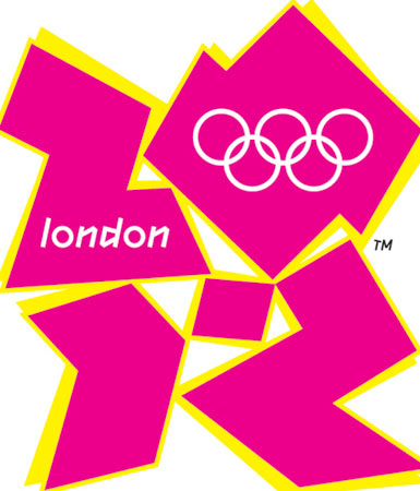
We all know how terrible the logo for the Olympics in London is, but nothing drove the message home more than when we saw this artwork by Alan Clarke.
Looking at this minimal, timeless design really shows just how visually repulsive the London 2012 logo is. We don't blame Clarke's decision not to include the monstrosity in his proposed artwork. Click here to view the logo, the 'design' is too awful to be featured here!
joes[a]fiend
![JOES[A]FIEND QR CODE](https://blogger.googleusercontent.com/img/b/R29vZ2xl/AVvXsEj3KiqyplNDzSE6uADwziK9hmQngCc58B2ozYZ2cdOuYFtitGOcFrlginoJBaVk6ZYh3ADfmTaNrhuE7_LuSZsPhdc5Nbv7bwO5u3CFGDShhH1igYvUJKUDZJD3bssUw6kq9fkBm6ZfiQ-H/s220/www.joesafiend.co.uk.png)
No comments:
Post a Comment